2022 - Product Design
iOS Presets
A concept tool to enable people to create a home screen that feels like home
ROLE
Product Designer
TIMELINE
1 Month
TOOLS
Figma, Adobe Ae
Problem Space
Has editing your home screen ever looked like this?
After going through the time-consuming and often frustrating task of manually dragging and dropping apps into the midst of digital clutter, we often end up with a home screen that “just works”.
Why spend up to hours editing and settle for something that “just works”?
Overview
Paving a new way
Constructing your home screen shouldn’t be a monotonous task—but a series of delightful experiences. This is where it all starts.
Take control
Have full autonomy over your home screen. Choose how you want to create your home; filter out what you don’t need.
Creating excitement
After selecting your apps, watch in anticipation as the cards turn over to reveal your new home.
Being versatile
Our needs are constantly changing, even within the day, our home screens should reflect those changes.
User Research
Insight 1: Everyone has a different idea of what their home screen should look like
From my interviews and surveys, it was clear that everyone has a different idea of what an "ideal" home screen looks like. Some people thrive in the disorganized clutter, while others can’t bare to look at a home screen that isn’t sorted to their preferences.
Insight 2: People don’t always have the motivation to organize their home screens
It seems that organizing your home screen falls victim to the Fogg Behavior Model. Where for a lot of people, the mental cost is too high and they don’t have enough motivation to complete the action. My goal here would be to reduce this mental cost required to organize your home screen, so that regardless of motivation, the action is simple enough to be completed.
Insight 3: People don’t use all the apps they have installed
We don’t use all the apps that we install. This is not to say that the apps we don’t use are useless, but rather it’s not always imperative that these apps are on our home screen.
Image by Hardik Shah via:
So, who are we designing for?
From the surveys and interviews that I conducted, I created personas that represented a spectrum of different user goals and pain points.
Raina
Raina is very organized and particular about her home screen. She has spent hours on her home screen to make sure it’s tailored to her exact preferences.
Jay
Jay doesn’t care much for the organization of his phone’s home screen. His home screen is messy, but it’s functional to him. It’s not optimal, but he settles with it because he has no incentive to make changes.
Goals
Aiming for the “IKEA effect”
The IKEA effect is a cognitive bias in which people tend to place higher value to products they have partially contributed to. The key to achieving the IKEA effect is: high value, high contribution, but low effort. The goal is to apply this principle to Presets. We want people to create and value their home screens with minimal effort.
By Anton Nikolov via:
https://uxdesign.cc/design-principle-ikea-effect-2d908b2de81
Ideation
Sketching it out
Before jumping into frames, I very roughly sketched out what the primary flow would look like. After a few sketches, I landed on a flow that I would end up pursuing.
Wireframes
Putting thoughts into frames
After sketching out potential solutions, I hopped into Figma and started wireframing these ideas. I like to get started with mid-fidelity wireframes just so that my ideas are more easily understood by others and myself. It’s ultimately easier for me to visualize the solution and how it would evolve this way.
Iterations
Refining the core experience
Shown here, are a few of my iterations when it came to selecting a home screen layout. One of the takeaways I learned from doing this is that the screens should be large enough to view easily, showing one screen at a time allows people to process the information more easily.
Final Designs
Building a new home
To establish a clear mental model and reduce initial friction, the final design includes strategic onboarding. By providing users with a high-level overview and essential directives before they enter the core flow, we eliminate ambiguity and ensure a more predictable, seamless experience.
Choosing your apps
The flow starts with a curated list of your most-used apps. You can accept these defaults or customize the list to your preference.
Discovering your new home
The system generates five curated home screen templates. Each option leverages different widget sizes and page structures, providing a flexible foundation that adapts based on the user's previously selected apps and priorities.
Switching between homes
Users can name and save their custom configurations as Presets. Once saved, the onboarding screen is replaced by a Preset Gallery, allowing for instant switching between saved environments
Reflections
Takeaways
This project was actually a huge challenge for me. It started out as a fun idea that quickly turned into a project that would go in many different directions. That being said, I’ll share my takeaways and reflections here.
1. Designing for mental models
This project reinforced that users don't just use products differently — they perceive them through entirely different mental models. I realized that my role wasn't to force a universal solution, but to build a flexible framework that adapts to diverse needs. By shifting from a feature-first mindset to a 'user-goal' focus, I learned to simplify the experience, stripping away the noise to protect the core value of the product.
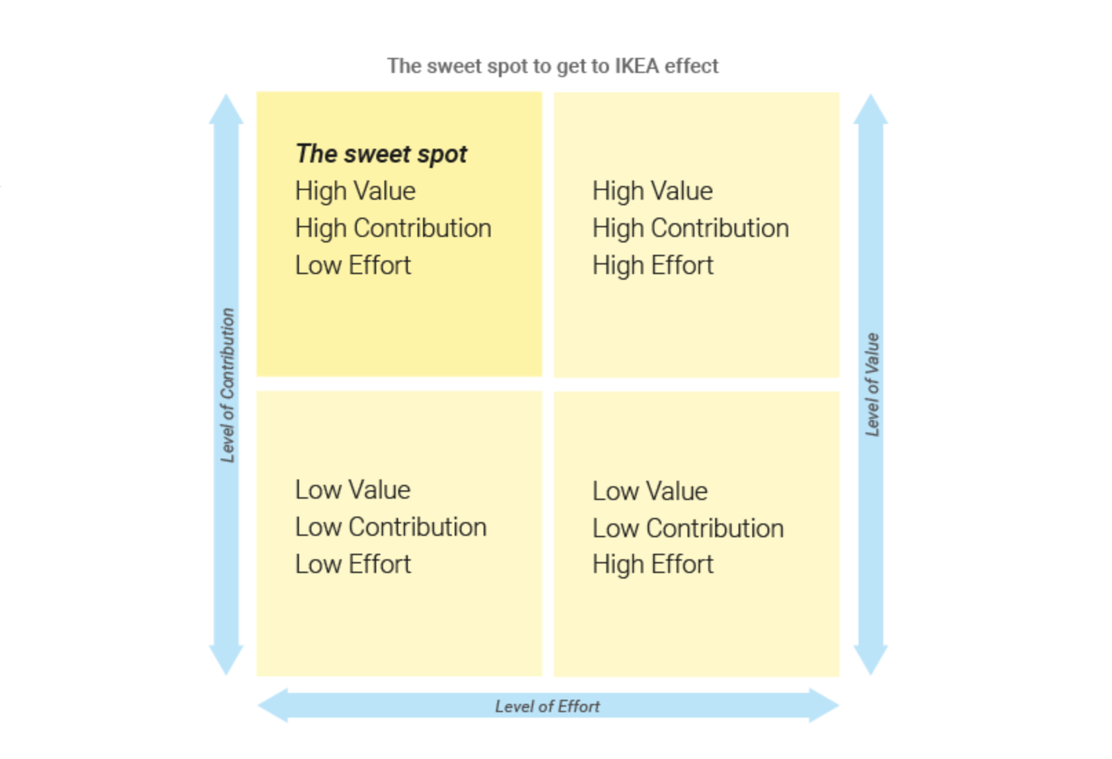
2. What would I do differently?
In retrospect, I’d love to dive deeper into the Information Architecture for app selection. While I explored several directions, there’s still a natural tension between offering high customization and keeping the list from feeling overwhelming. Given more time, I’d use A/B testing or deeper data analysis to find that perfect 'sweet spot' between granular control and total simplicity. This project was a great lesson in managing complex trade-offs, and I’m excited to keep tackling these types of challenges as I grow.